STEP
1
Open Illustrator and create a new document. The size is not
important right now. After that get thePolygon Tool and create a
triangle.

STEP
2
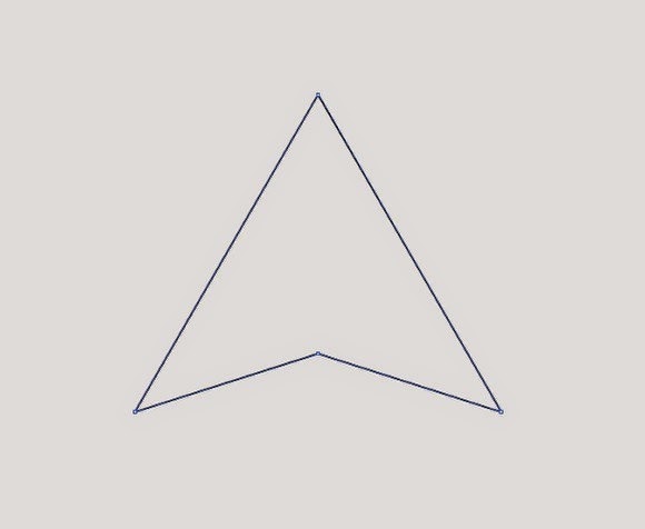
With the Pen Tool (P) create a point in the
middle of the base of the triangle. After that with theDirect Selection Tool
(A) select the point and move it up like the image below.
STEP
3
Duplicate the triangle twice. After that rotate one of the
copies (1). Select 2 of the triangles, the original and the one you
rotated and go to Window>Pathfinder. Select the Minus
Front option over the Shape Mode, it's the second. You
will have to delete some parts to leave just the ones inside of the original
triangle.

STEP
4
With the Rectangle Tool (M) create a rectangle
like from the bottom left to the center of the base (1). After that with
the Pen Tool (P) delete and move to create half of the base of
the symbol (2).
Repeat the same process to create the other half of the base.
Use the image below for reference.

STEP
5
Repeat again the previous step to create the right side.

STEP
6
It's time to make some adjustments, with the Direct
Selection Tool (A) move the points to make the symbol a little bit
bolder. Use the image below for reference.

STEP
7
Now it's time to add some colors. I used 4 basic colors, pink,
yellow, green and cyan (1), the order is very important. After that go
to Window>Transparency. Select the all objects and change
theTransparency mode to Multiply. By doing that
there will be 3 new colors, red, dark green and purple.

STEP
8
Create a new document, I used A4 for the size.
Then with the Rectangle Tool (M) create a rectangle to fill
the whole page. Change the color of the rectangle to (#383434).

STEP
9
Copy the symbol from the other document and paste it in the new
one with the dark background. As I was using Multiply for
the Transparency Mode, the symbol won't be shown. So, change theTransparency
mode back to Normal and change the color of the symbol to white.

STEP
10
Now just paste again the color symbolo and align it to be over the
white version. That way the colors will be visible.

CONCLUSION
Now let's finish the poster adding the logotype
"Abduzeedo" with the slogan "abducted by design".
The idea of this little walkthrough was to show you the creative
process behind the new symbol we will be using on Abduzeedo now in 2010. We are
still working on some new features, so you will start to see this symbol more
and more.
Also we will have this poster printed in case you want to
support the blog, as well as t-shirts

.
LIGHT
EFFECT VERSION
With the icon done I created another version of the poster
adding some old school light effects. But this is for the next tutorial.


0 comments:
Post a Comment